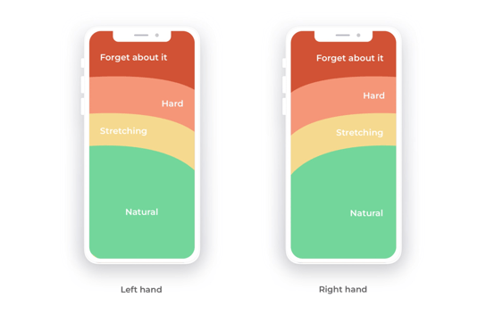
When the iPhone was introduced you could comfortably access the entirety of the screen with one hand. But with the invent of phablets (massive phones) it has become near impossible to reach the entirety of the screen. The following illustrates the thumb reach of users on large phones and the ergonomic reality of using it with one hand:
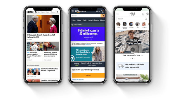
If we look at some of the most commonly accessed websites in the UK, we can see the same thing. All of the menus/navigation access is at the far top of the screen:
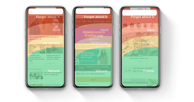
If we overlay the ergonomic image about thumb reach for a righthanded person, we can see that the navigation elements of the three sites (in white) are all in the ‘Forget about it’ part of the spectrum:
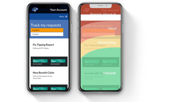
In the spirit of best practice, we thought we should do the same test with our digital platform OneVu and, unsurprisingly, we found the same thing:
So, what to do! If we look at the private sector, we can see how some organisations have already tackled this. Below we can see how Uber has changed its design to place a focus on carrying out actions at the bottom of the screen:
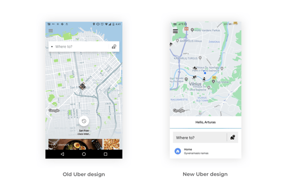
Now the actions a person can do are entirely in the ‘Natural reach area. With the same principles we have now added a new floating menu to OneVu as shown here:
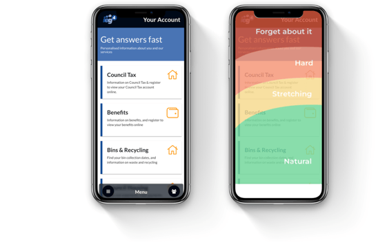
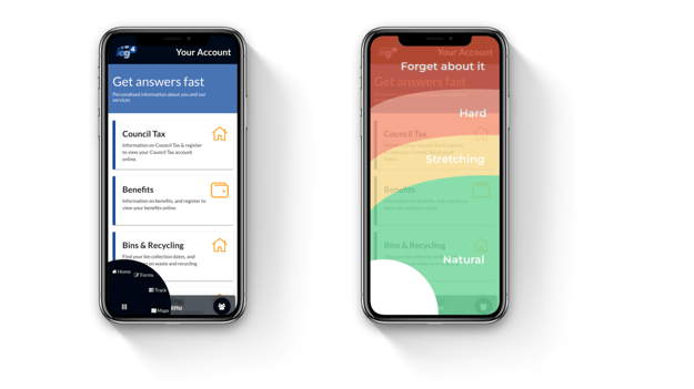
However, we felt the challenge was less about the positioning of the menu and more about what happens when you click the menu. You see, if there are 8 options under the menu, then you’re going to have to use more of the screen to show them meaning you might end up with options in the Stretch/Hard/Forget about it regions.
So we came up with a different approach that uses dual circular menus. These show user-related content on the right and navigational content on the left.
We believe user experience is vital to the take up of online services and matters even more in the public sector where it is essential we make it as easy as possible for people to engage digitally. We care about the minutiae because making lots of little things better over time results in a compelling customer experience.

